Canyon
Propelling the world’s best bike brand furtherRole:
Design Director / Designer
Project:
E-commerce
Outcomes:
UX Design, UI Design, Customer Experience Audit
Overview
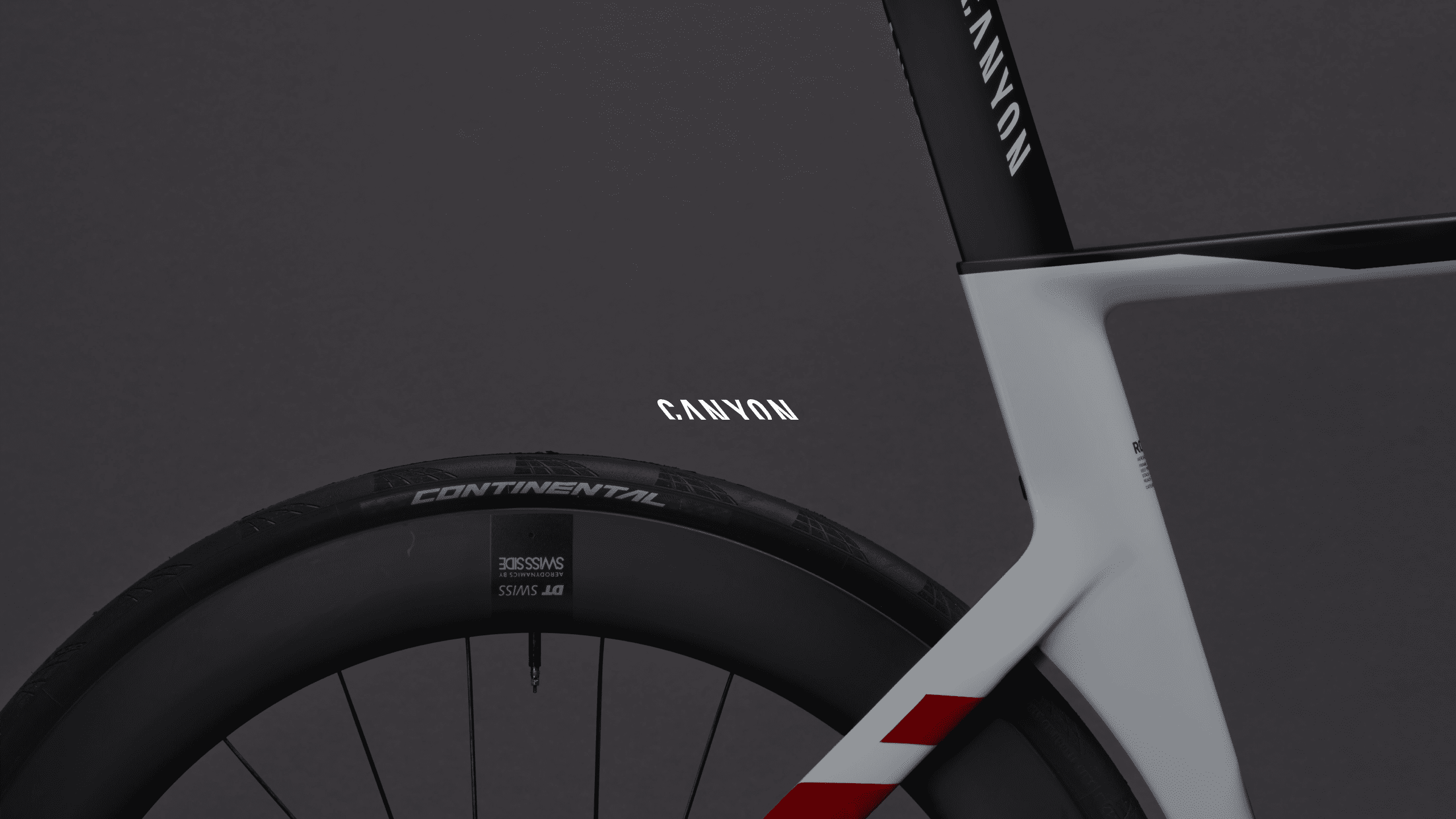
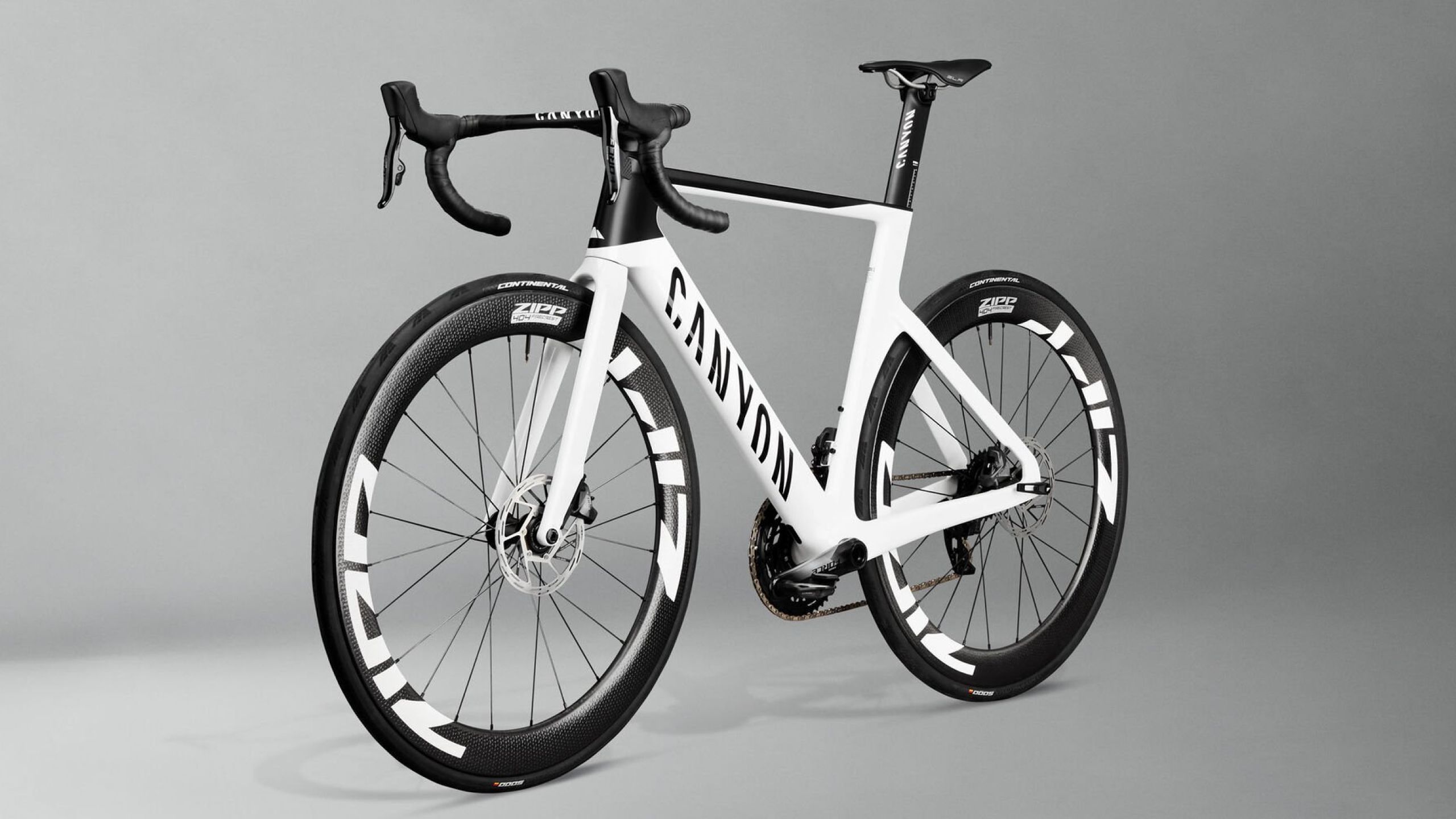
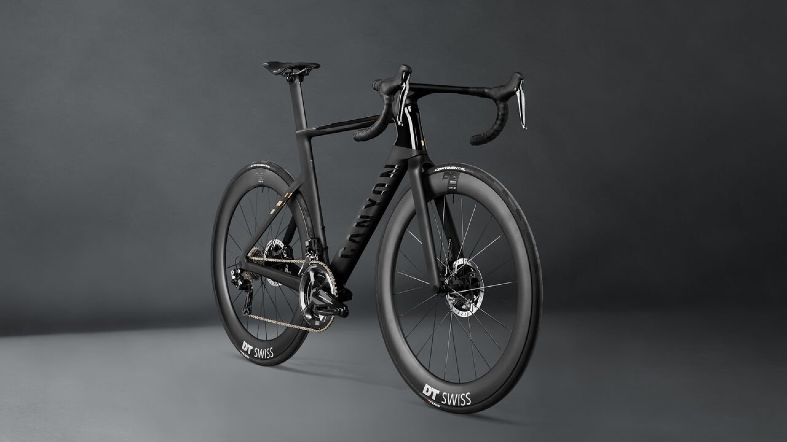
Canyon Bicycles is a German manufacturer of racing, mountain and triathlon bikes. Canyon supplies cycling fans worldwide with its range of incredible bikes. The brand offers higher end components than other manufacturers can match at each price point, largely made possible thanks to its direct sales method.I recently partnered with the Canyon customer experience team to improve user journeys, increase conversion, improve the visual and interaction design; adding value to the retail experience. My work consisted of evaluating, redesigning and testing: site navigation, checkout experience and creating pre-launch page designs for their eagerly awaited 2020 premium bike range; the Aeroad.
Canyon.com


Actions
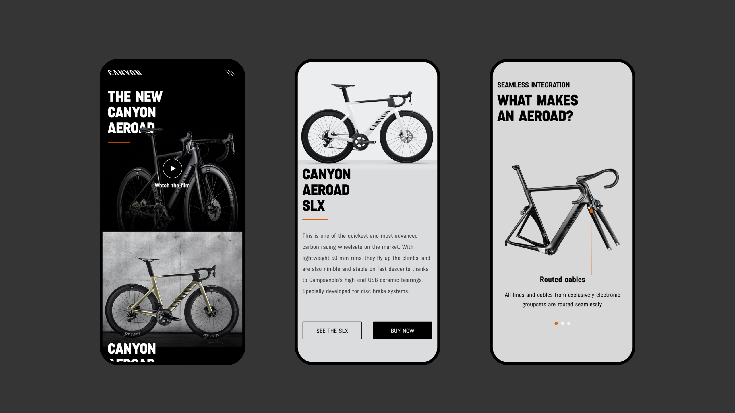
The project involved working closely with the Canyon Customer Experience (CX) team to create key landing pages for the new bike launch giving a broad overview of the updated sepecifications and diving into the bike’s close up details.Supporting this was the co-creation of a modular and expandable design system which can scale as new products are added.
The speed and simplicity of showcasing the new range was of primary importance - as well as providing a refined and simple search + find, up-sell and checkout experience.

Getting under the hood of Canyon.com
The Checkout
The shiny stuff aside, the checkout needed attention. It was an elongated process that had been a little neglected. There were 15 steps to make a purchase from adding to your cart to confirmation of payment. I managed to reduce this to a three step / five screen super simple process.
Search
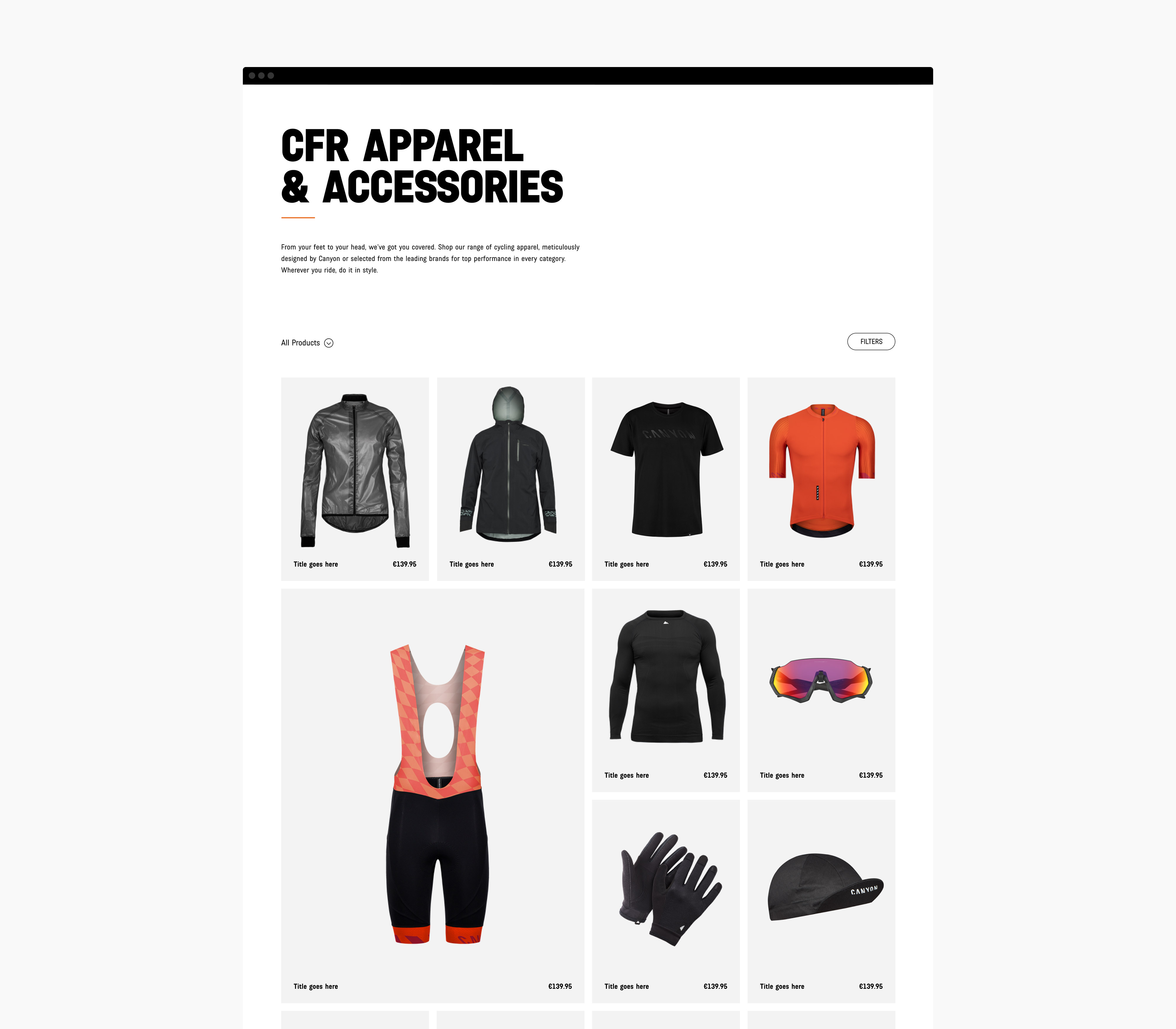
After runnning a set of customer and staff interviews to see how people used the search and navigation, I analysed the site search results and data, I could see the areas where improvements could be made. The functionality didn’t offer an appropriate level of depth to the search results. I produced a number of improvements such as ‘search while you type’, visually incorporating the products into the search results and re-categorising results based on the search data.

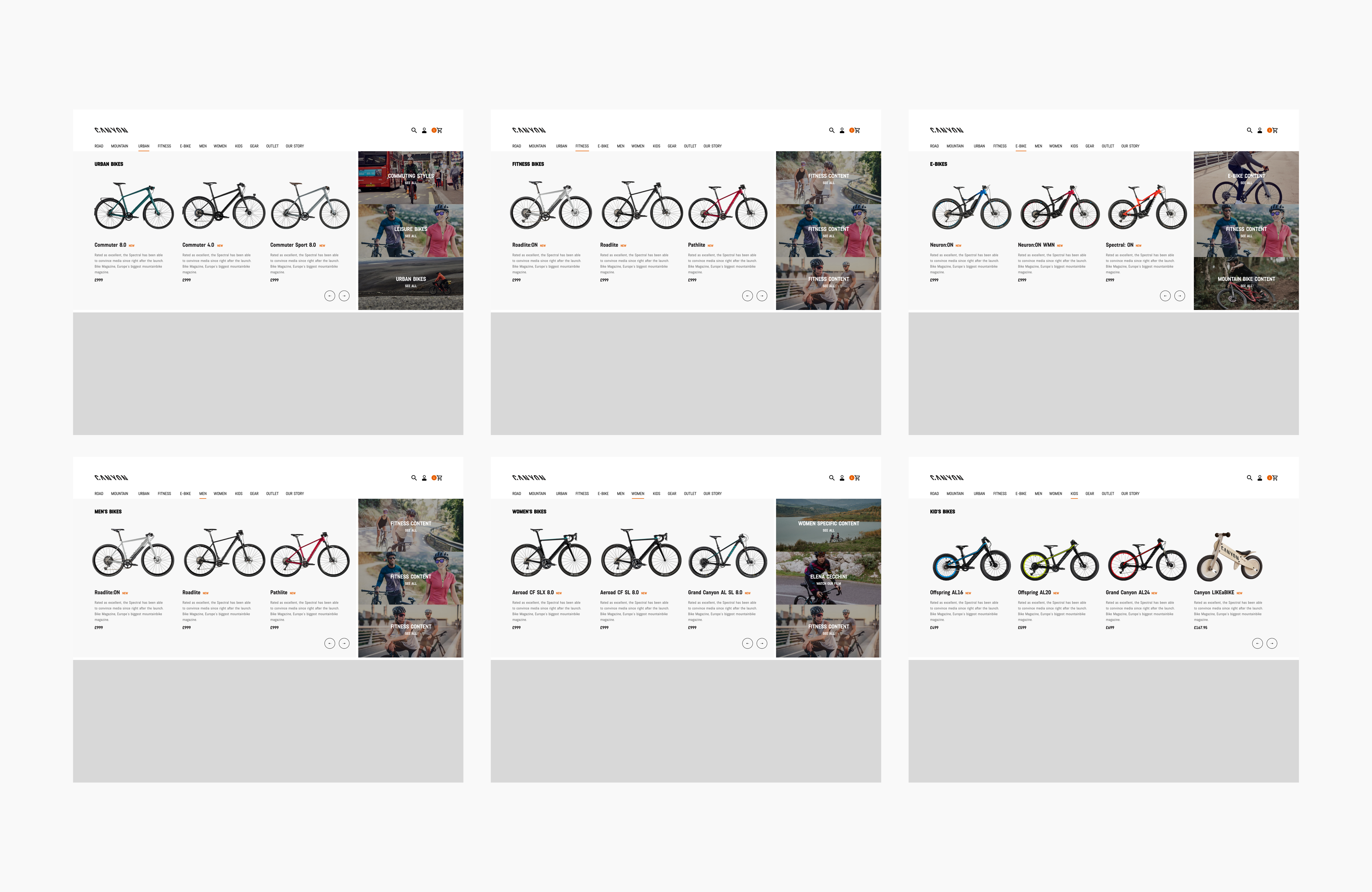
Navigation
User testing showed that Canyon.com suffered from navigation issues. My hypothesis was that the navigation should be based on data and simplicity. Customers were relying on search functionality to find the products they wanted on the site, and showing frustration at using the main navigation. So we stripped things back placing the most searched categories up-front. The customers had already seen the bikes in the press, so let’s show them what they’re after visually by using product shots to help with focus.
Promo panels on the right were added to add associated content such as new films, range launches and the occasional deal which served to strengthen the brand.

Results
Purchase completion rose dramatically on mobile and on desktop. Visit Canyon.com︎︎︎
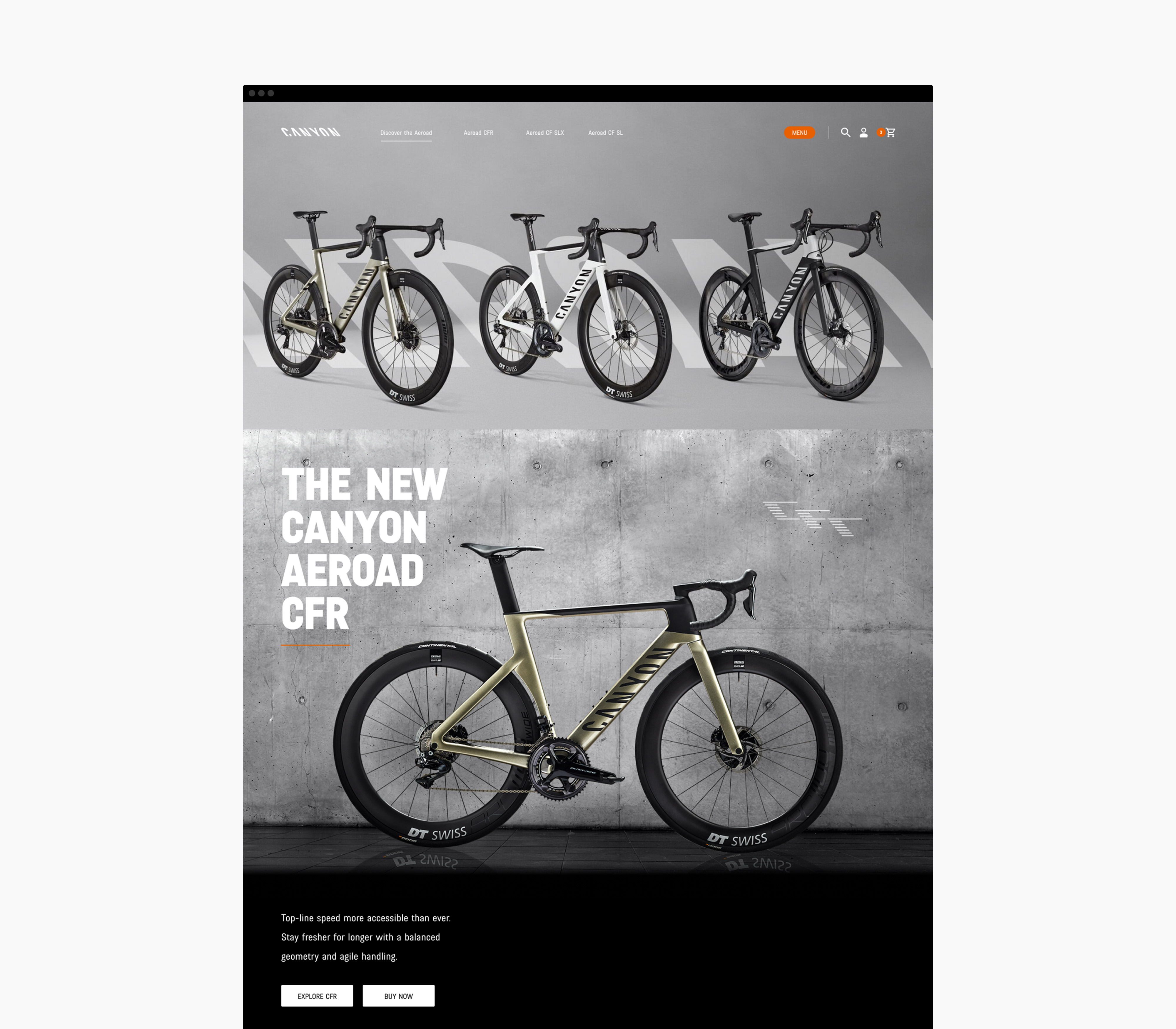
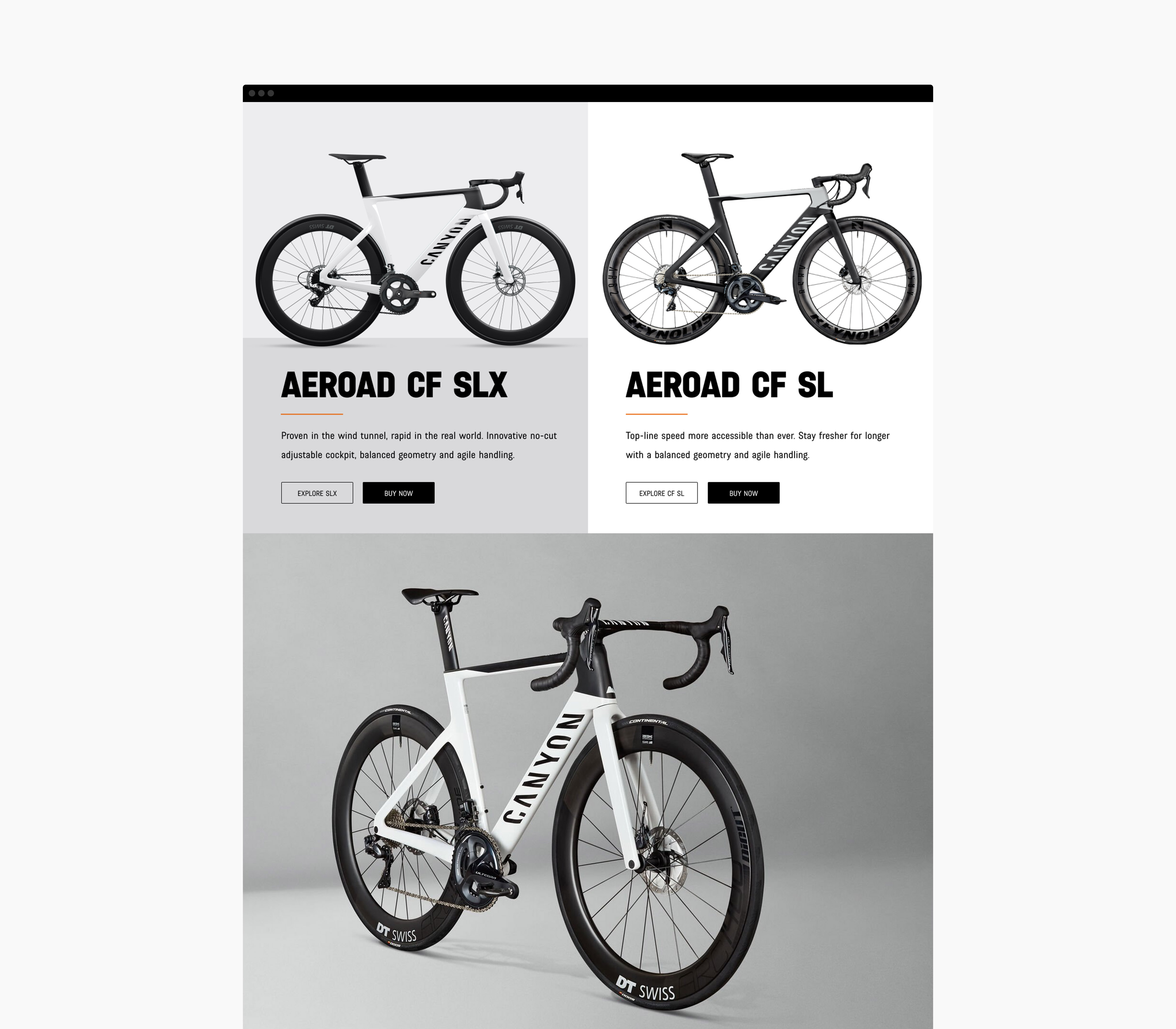
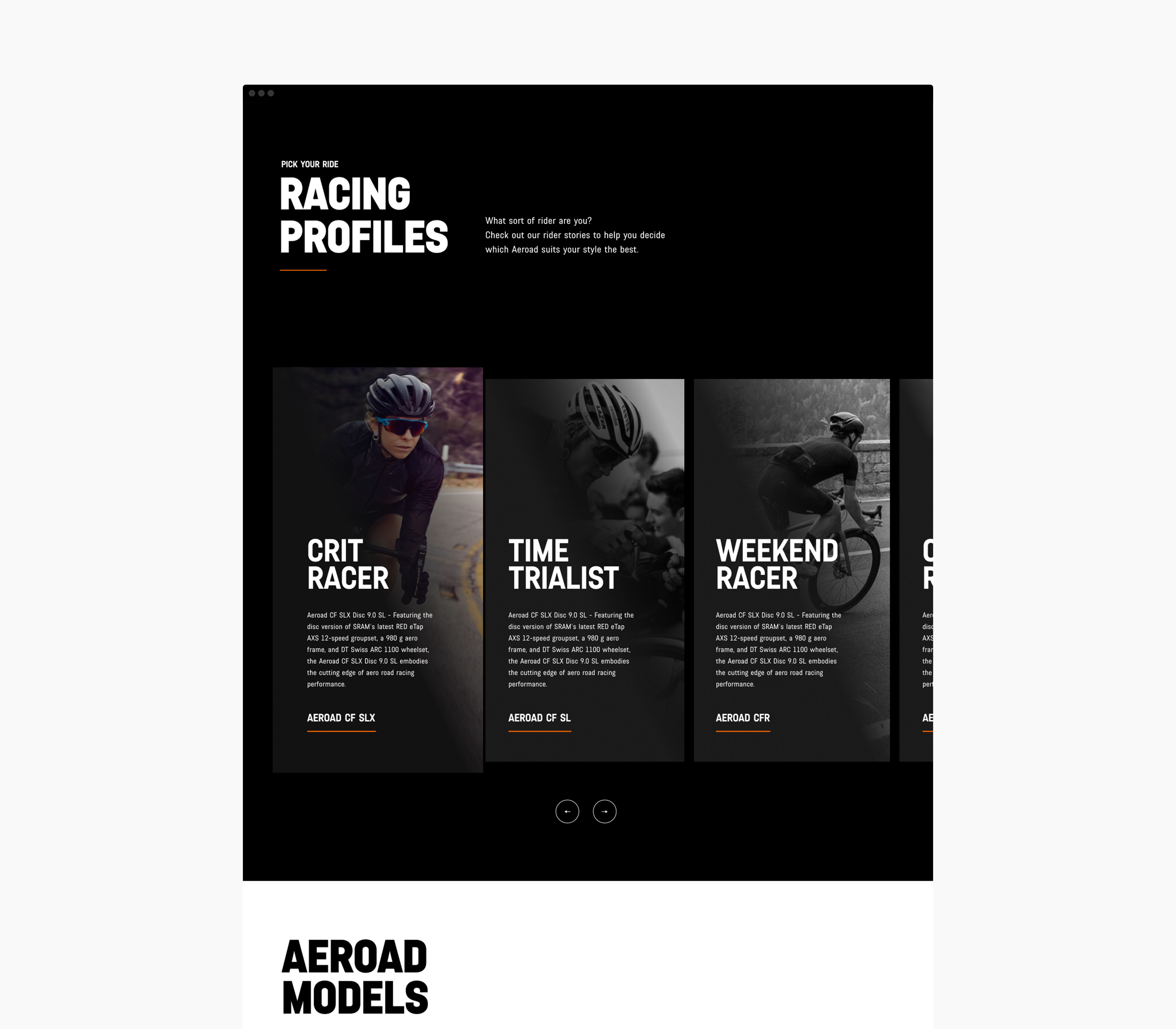

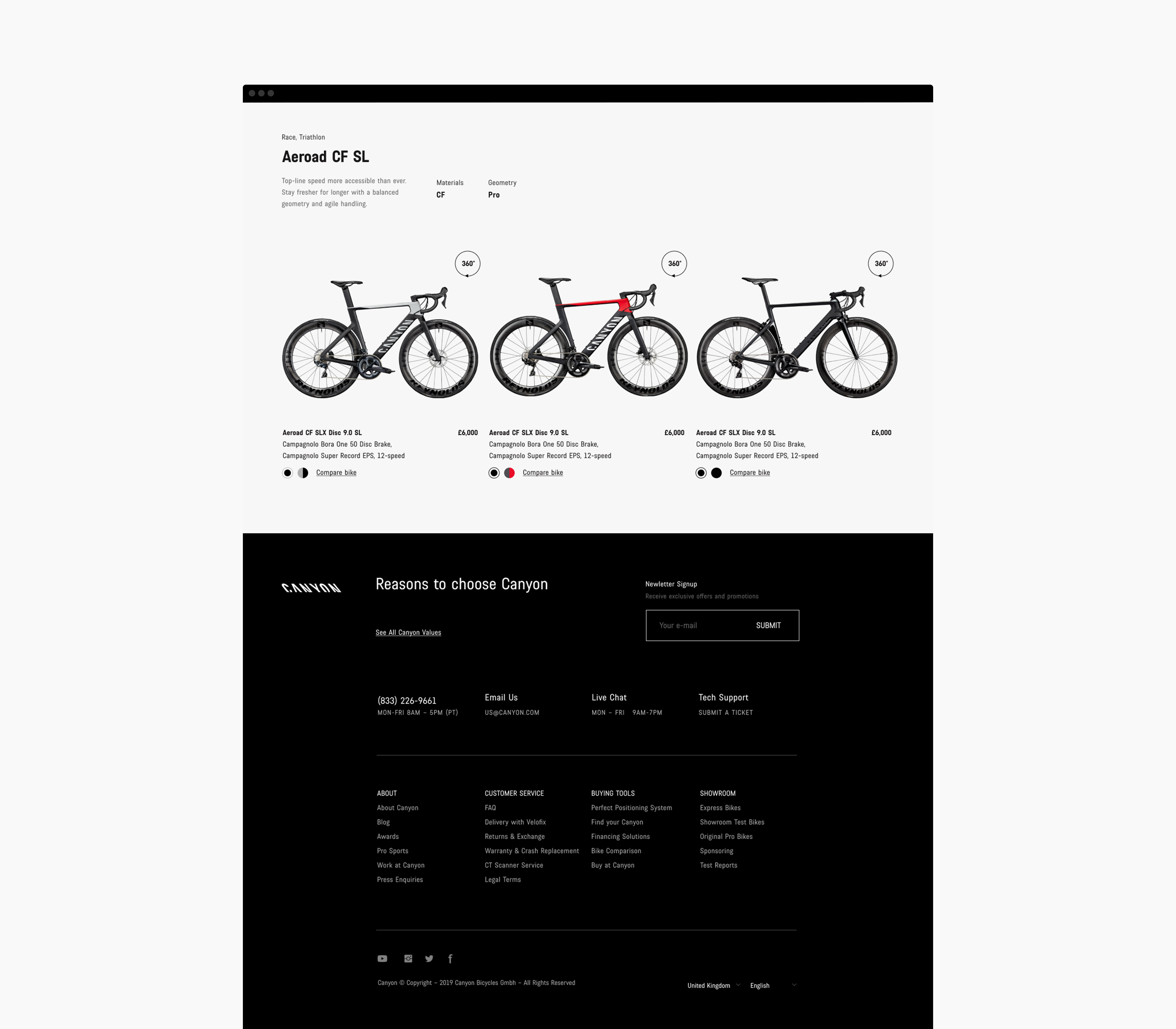
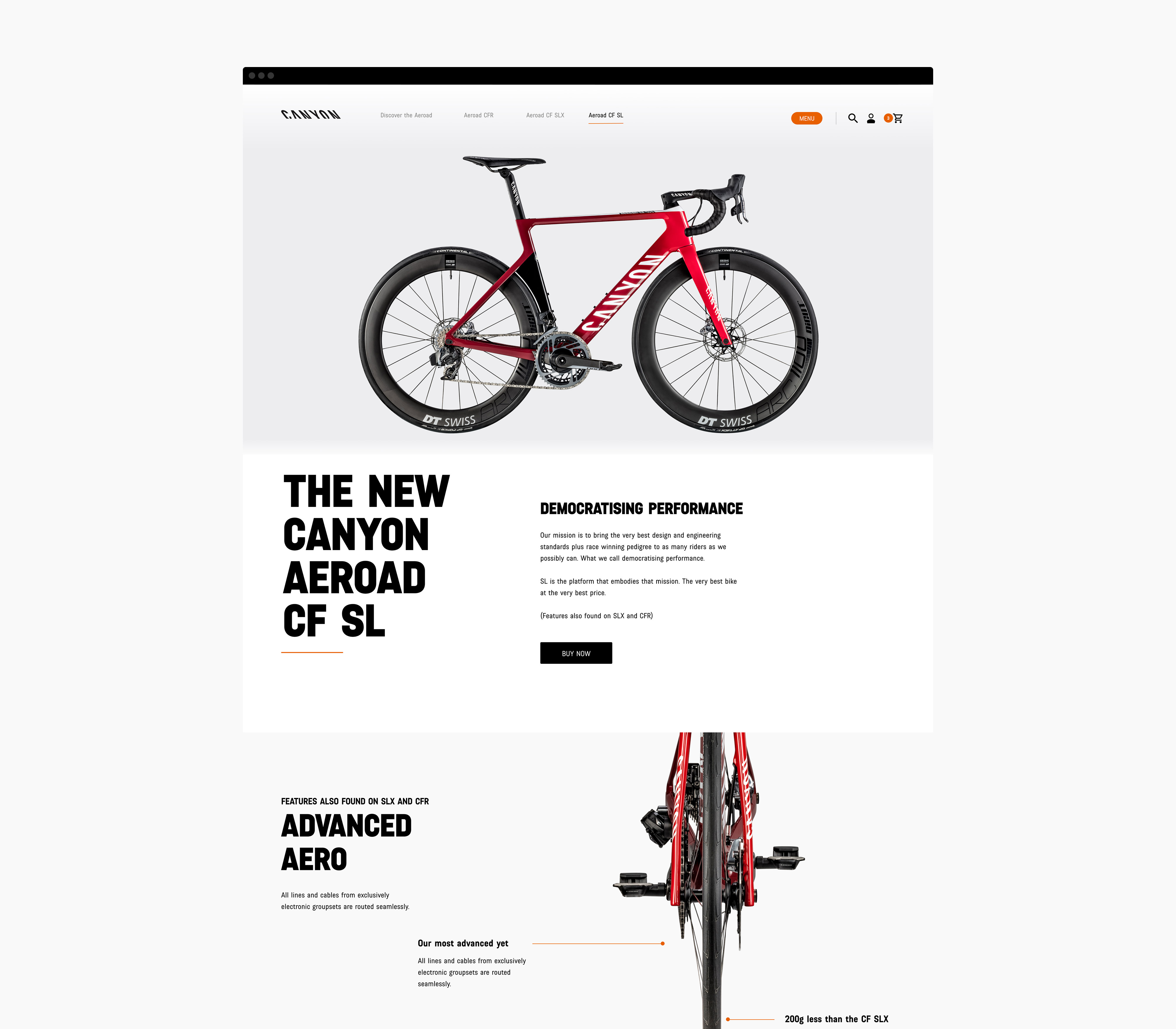
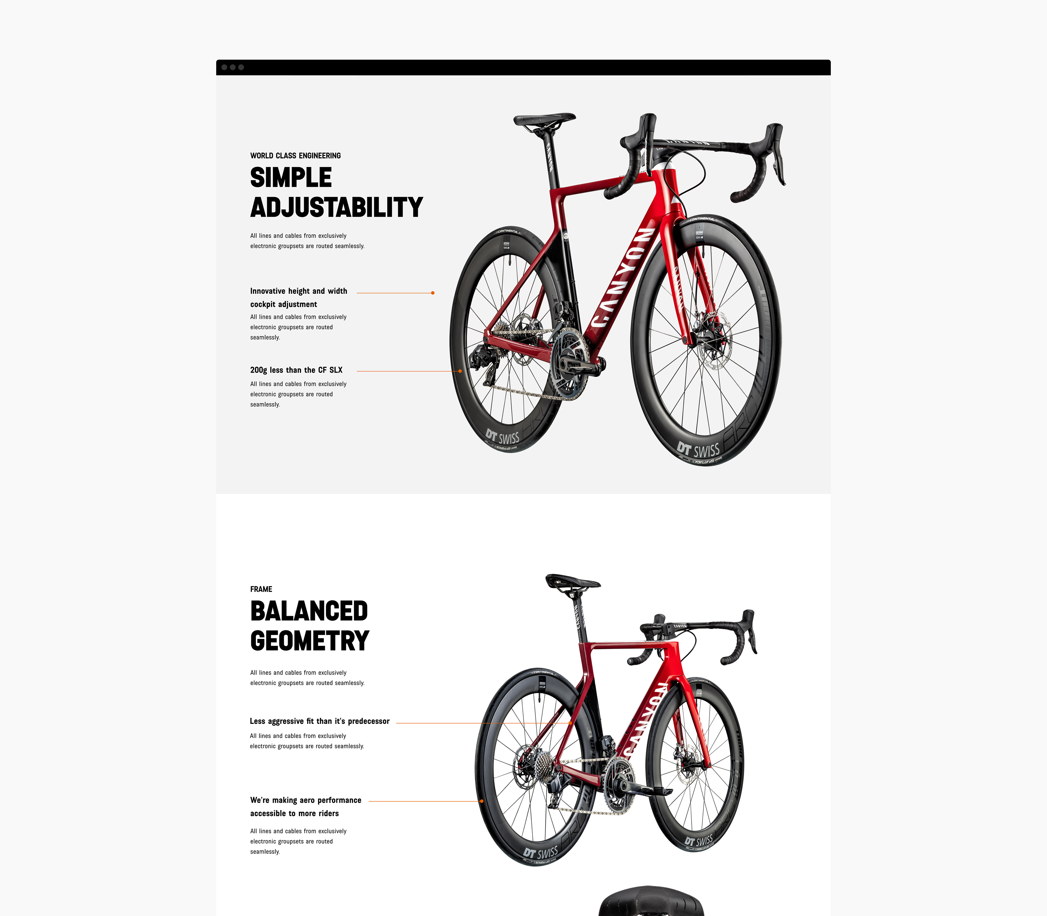
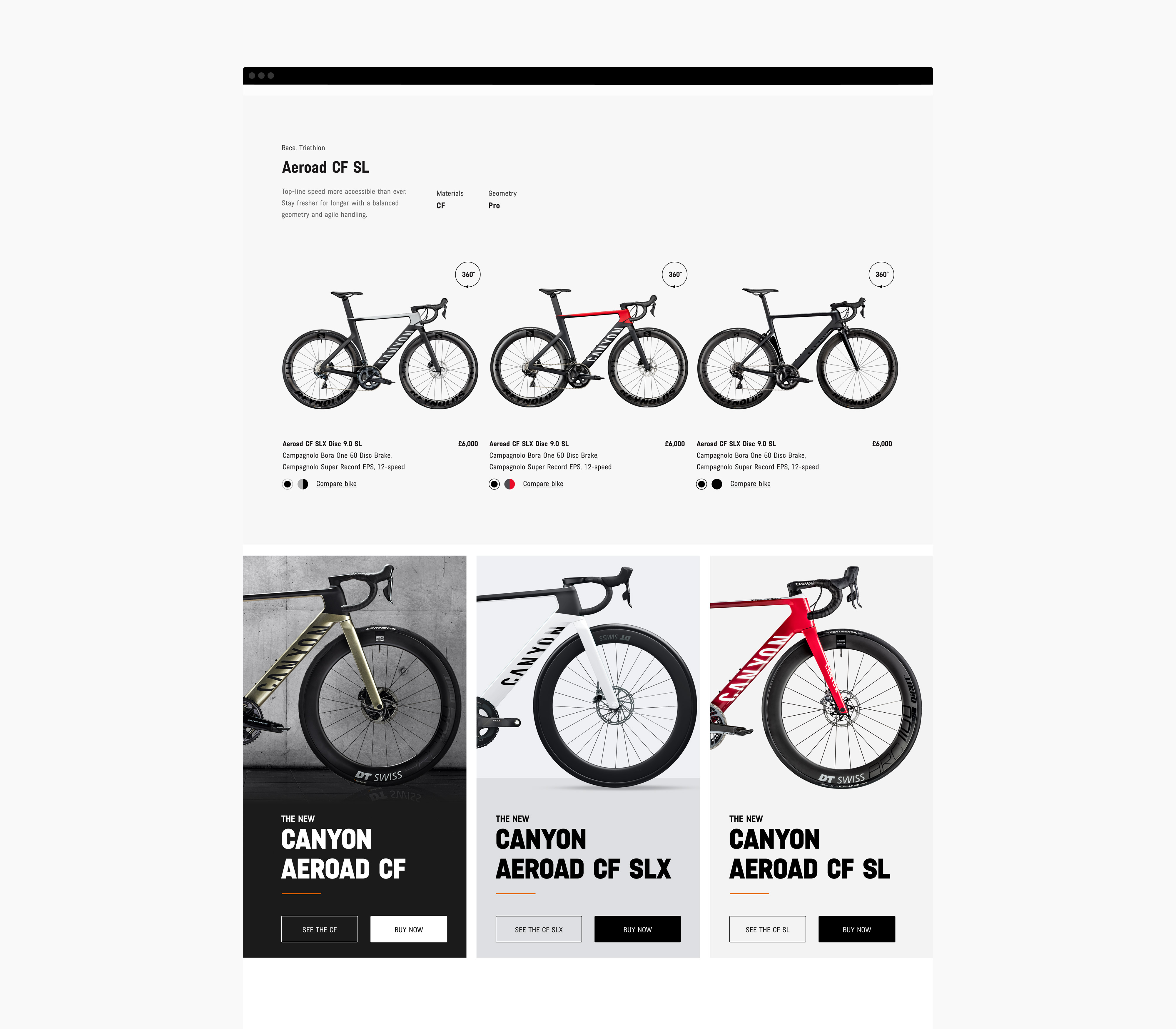

Product Launch Pages
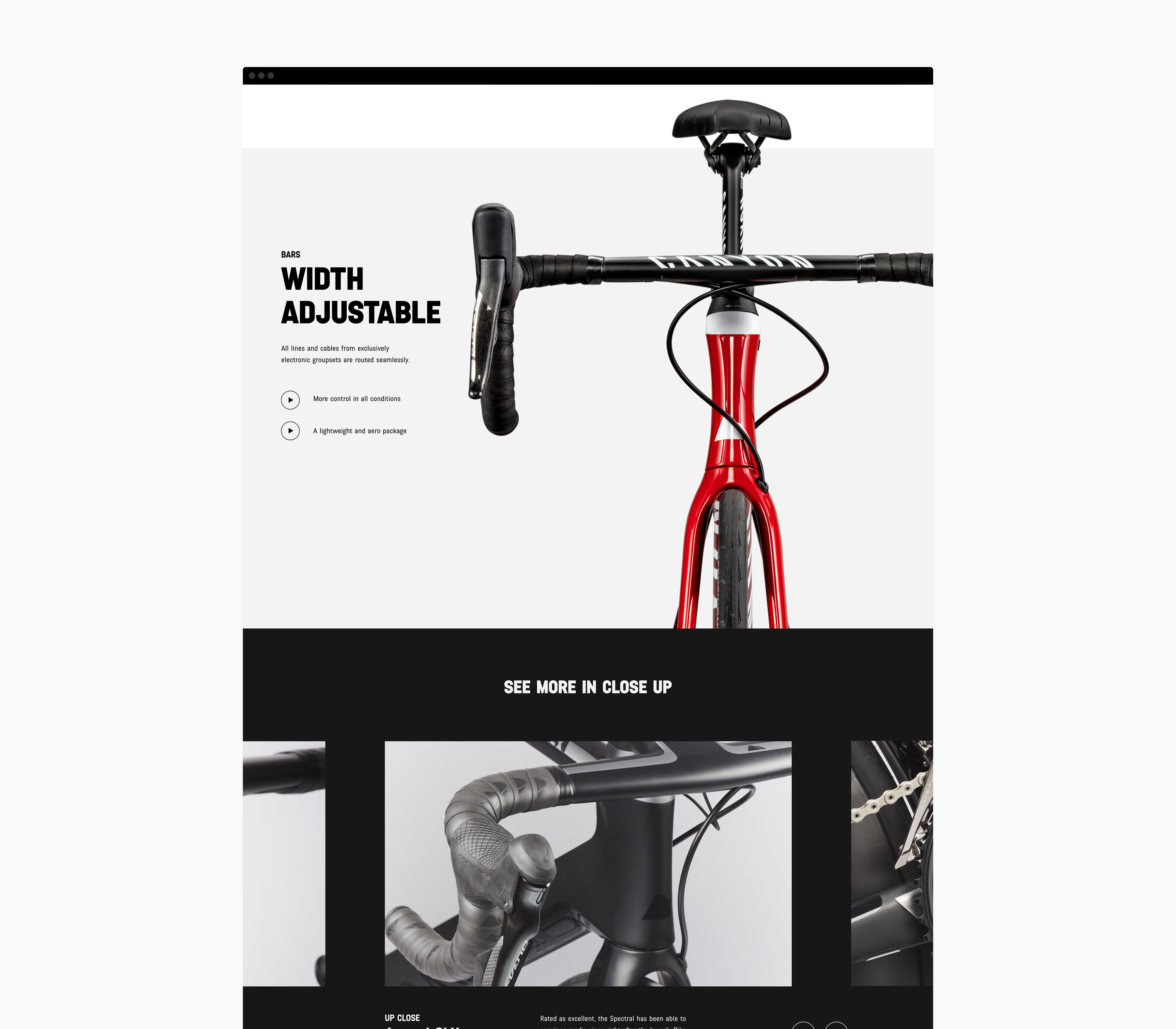
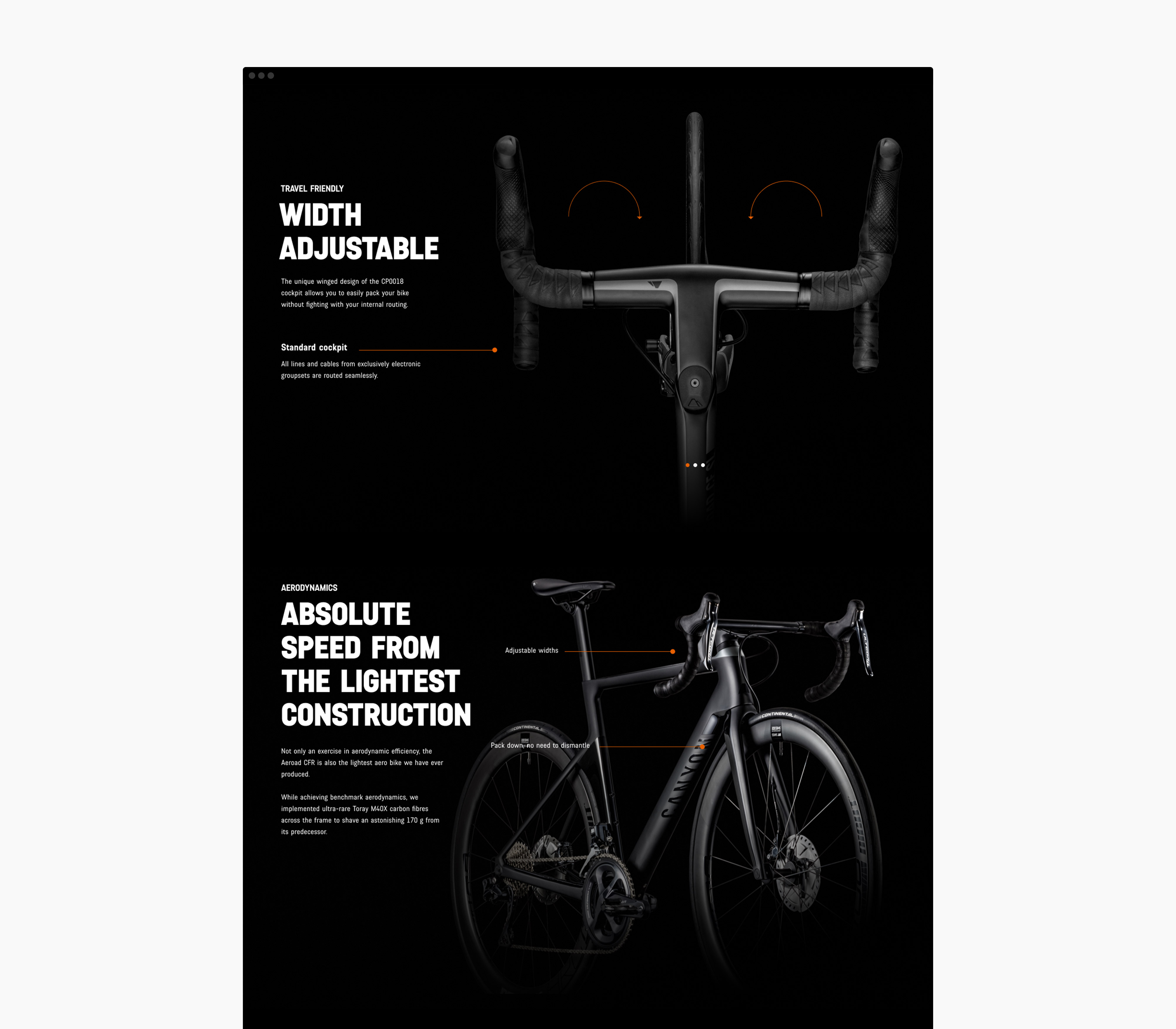
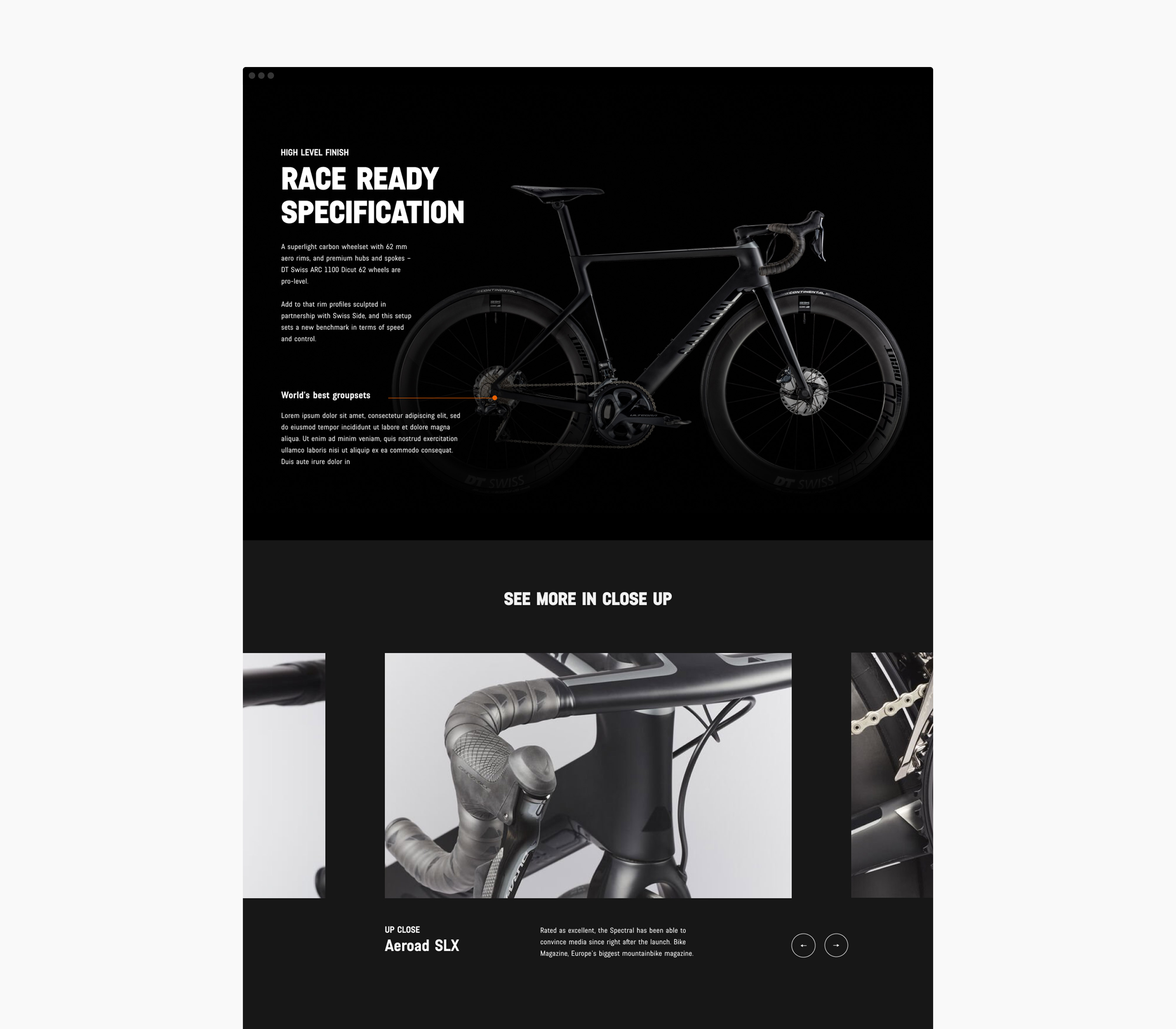
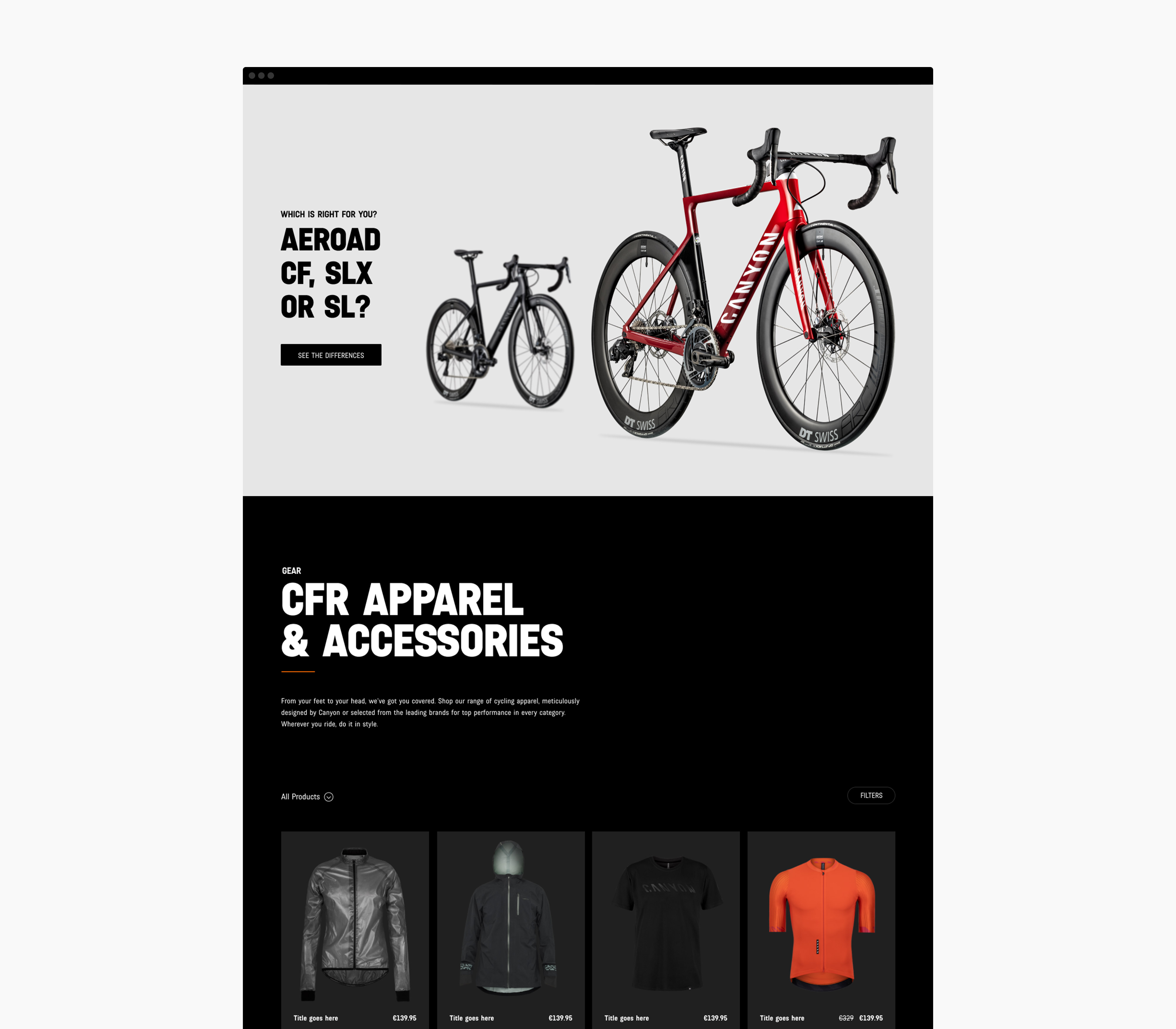
Further design work for the Aeroad CFR launch included interaction concepts to show the bike in closer detail, by bringing in the 3D CAD renders, Canyon allowed the customer to focus on the various engineered components to find out what improvements had been made over the previous models. Also by now allowing the cross-sell of associated branded merchandise was a key upselling moment in the customer journey.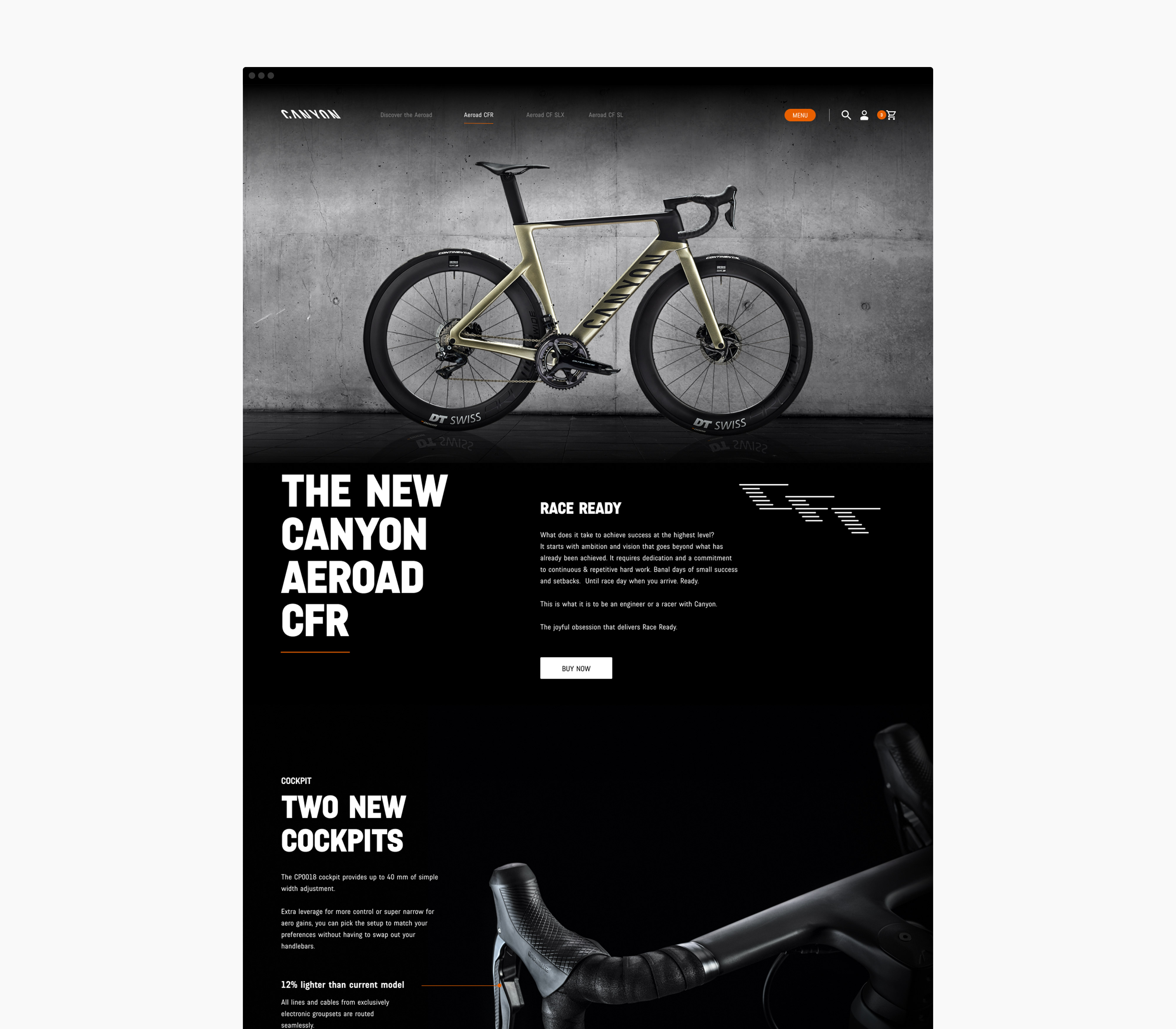
Team:
Gemma Germains (Head of CX), John Keiller (Strategy Director)
Canyon.com