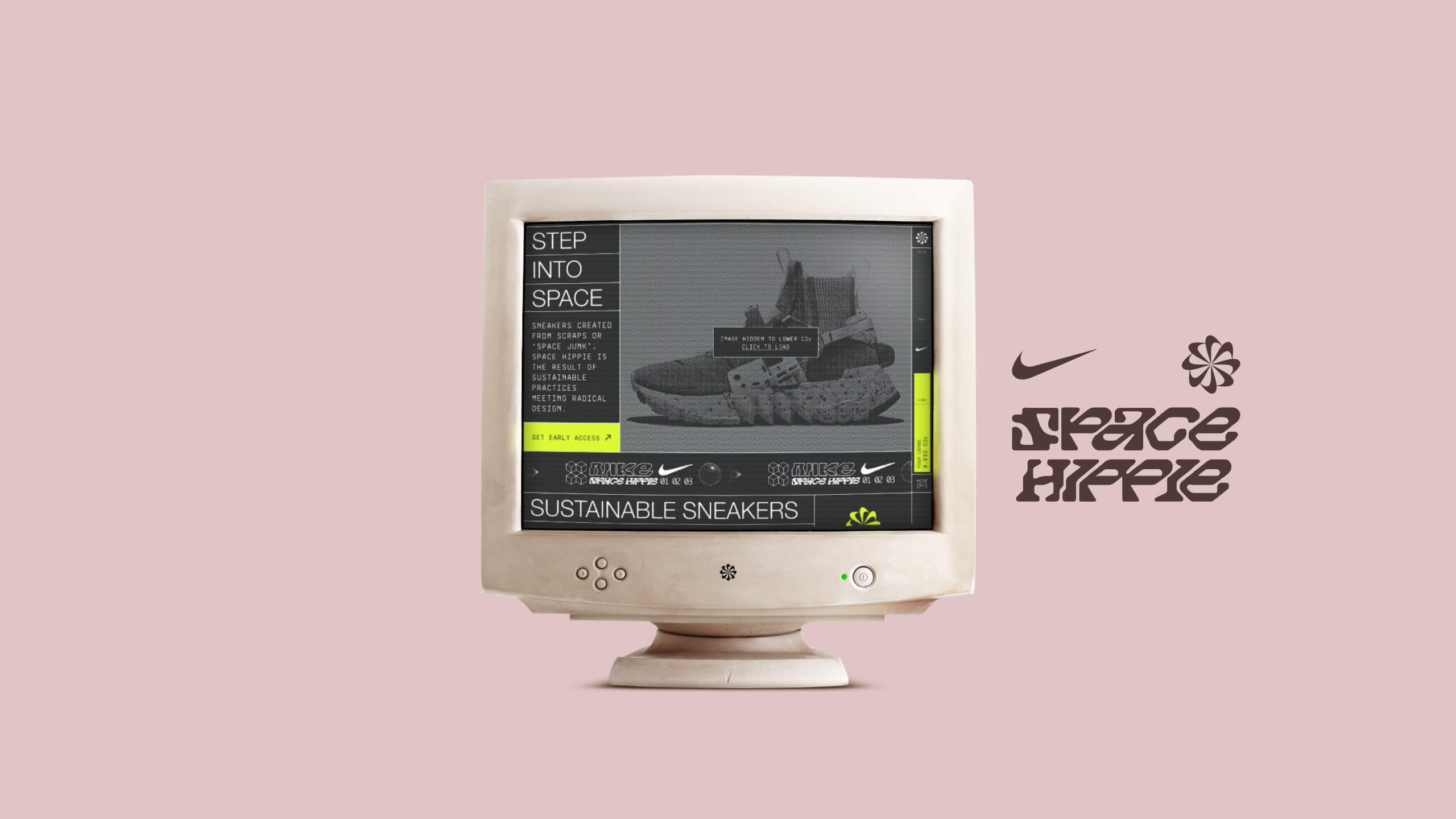
Nike — Space Hippie
A more sustainable sneaker websiteRole:
Creative Director + Designer
Outcomes:
Concept, Strategy, UX/UI Design
Period:
Q3 2022
Overview
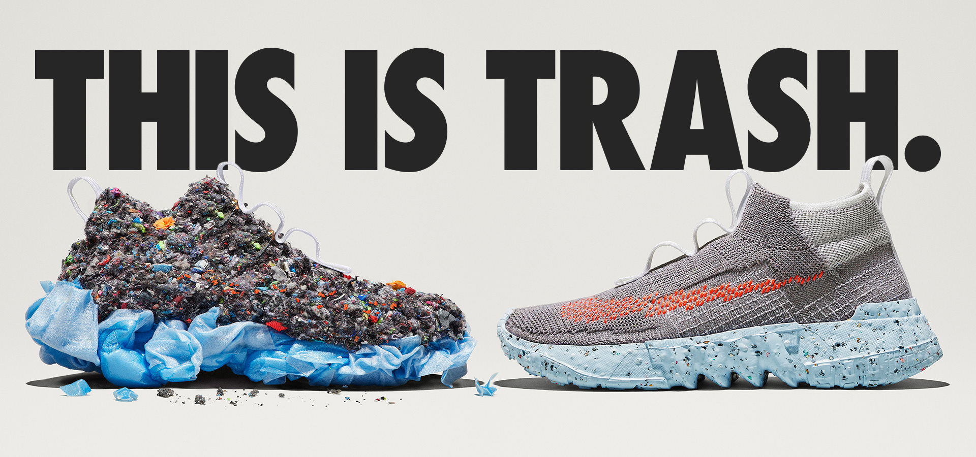
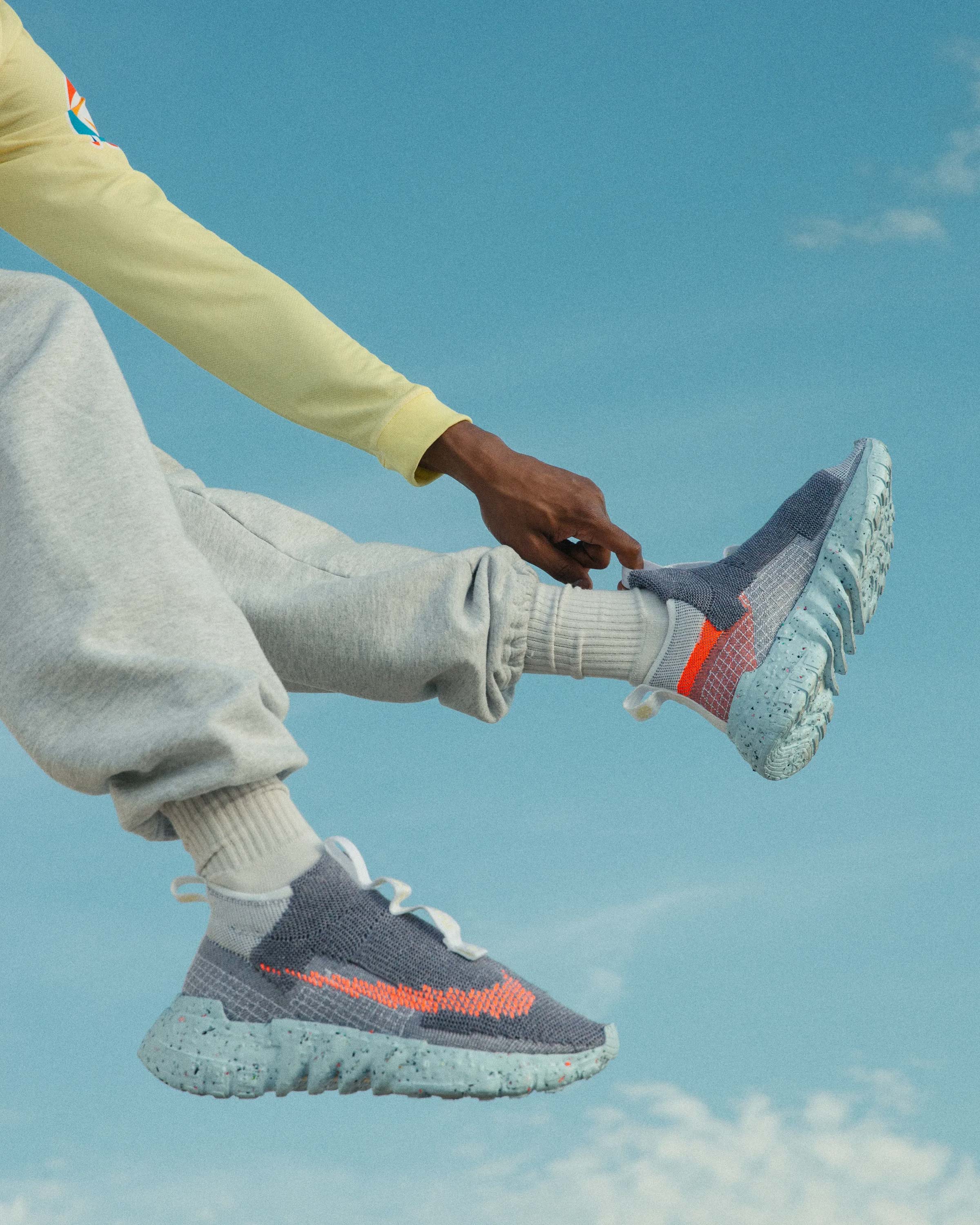
Nike’s Space Hippie sustainable sneakers weigh in at 25–50% recycled content, Space Hippie is trash transformed. They needed a digital experience idea and prototype to complement the launch of the next generation that could reflect their ‘Move to Zero’ manifesto, find new ways to power a Nike website and form early ideas about a sustainable digital footprint.Research
We examined the page load of nike.com which was pretty beefy. Over a year, with 1,000,000 monthly page views, nike.com produces 7,732.07kg of CO2 equivalent or 20,178kWh of energy, that’s enough electricity to drive an electric car 129,137km. So we thought could we do something? What if we could strip the whole experience back?- Could we go back to the basics of web1 or even the green screen terminals of the 1970/80’s?
- How would we get the best experience by just using a featherweight front end? Vanilla HTML, CSS and JS, make it a progressive web app and have some greener tracking and analytics.
- Could we show the customer that by making concious decisions about what to load and when that they could reduce their footprint while browsing?
-
Could we potentially self-host this on a Raspberry Pi to save even more energy or a sustainable host?
-
Could we activate the experience from the main nike.com website?
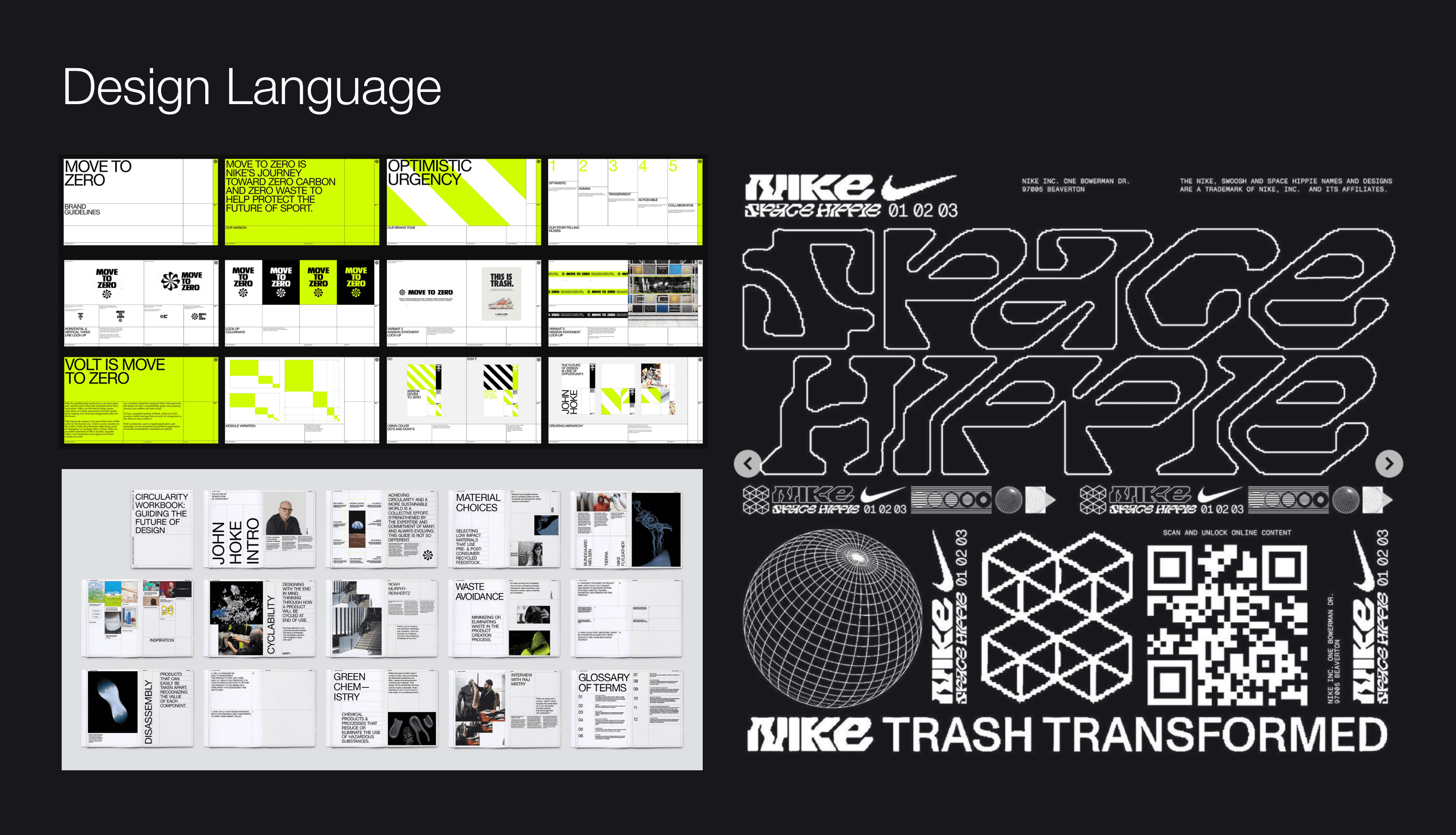
- We also had to honour the ‘Move to Zero’ and Circular Design Language.
Key Insights:
- Every time a user visits the Nike website, 1.56g of CO2 is produced
- In the past six months Nike.com generated 993.85 tonnes of CO2

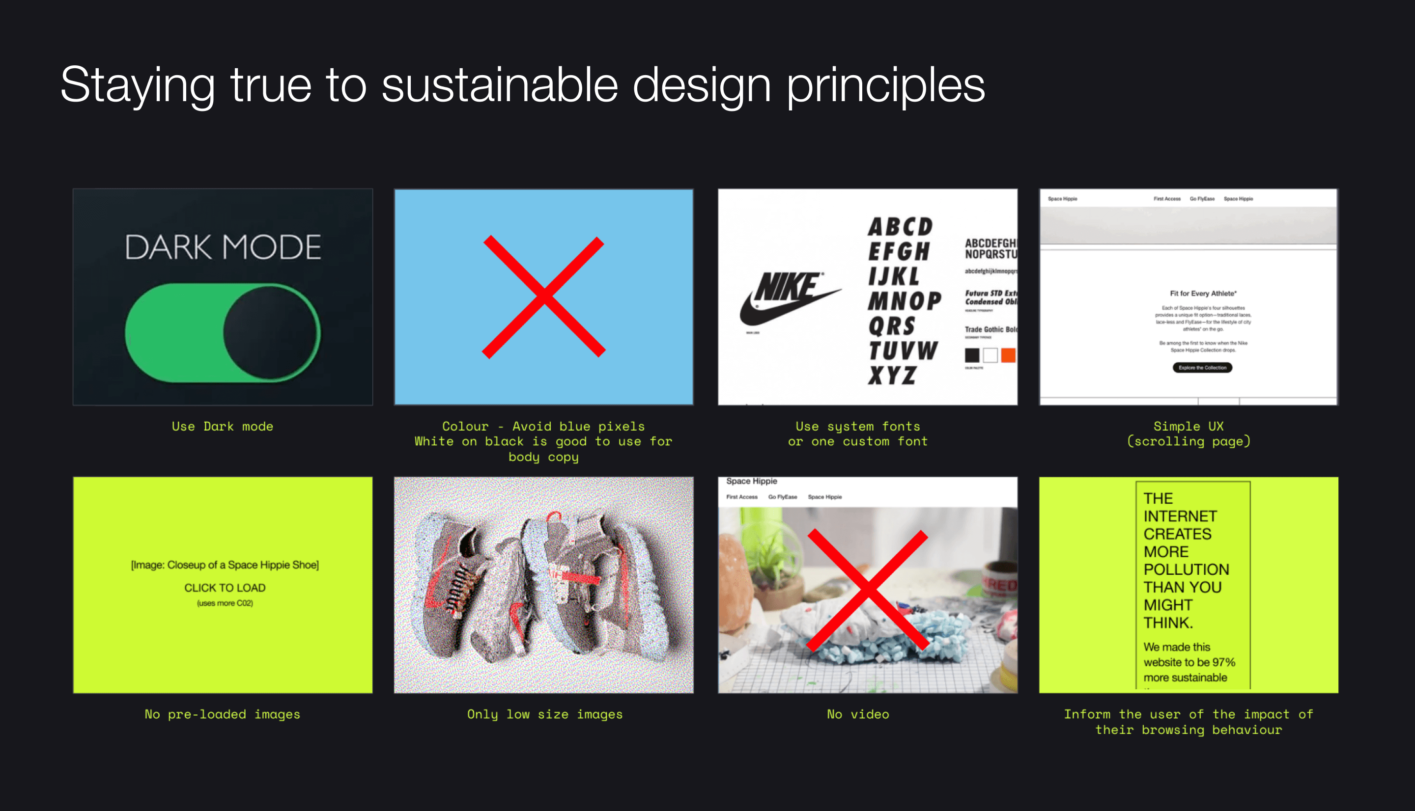
Some principles we set from the start

Early Stages
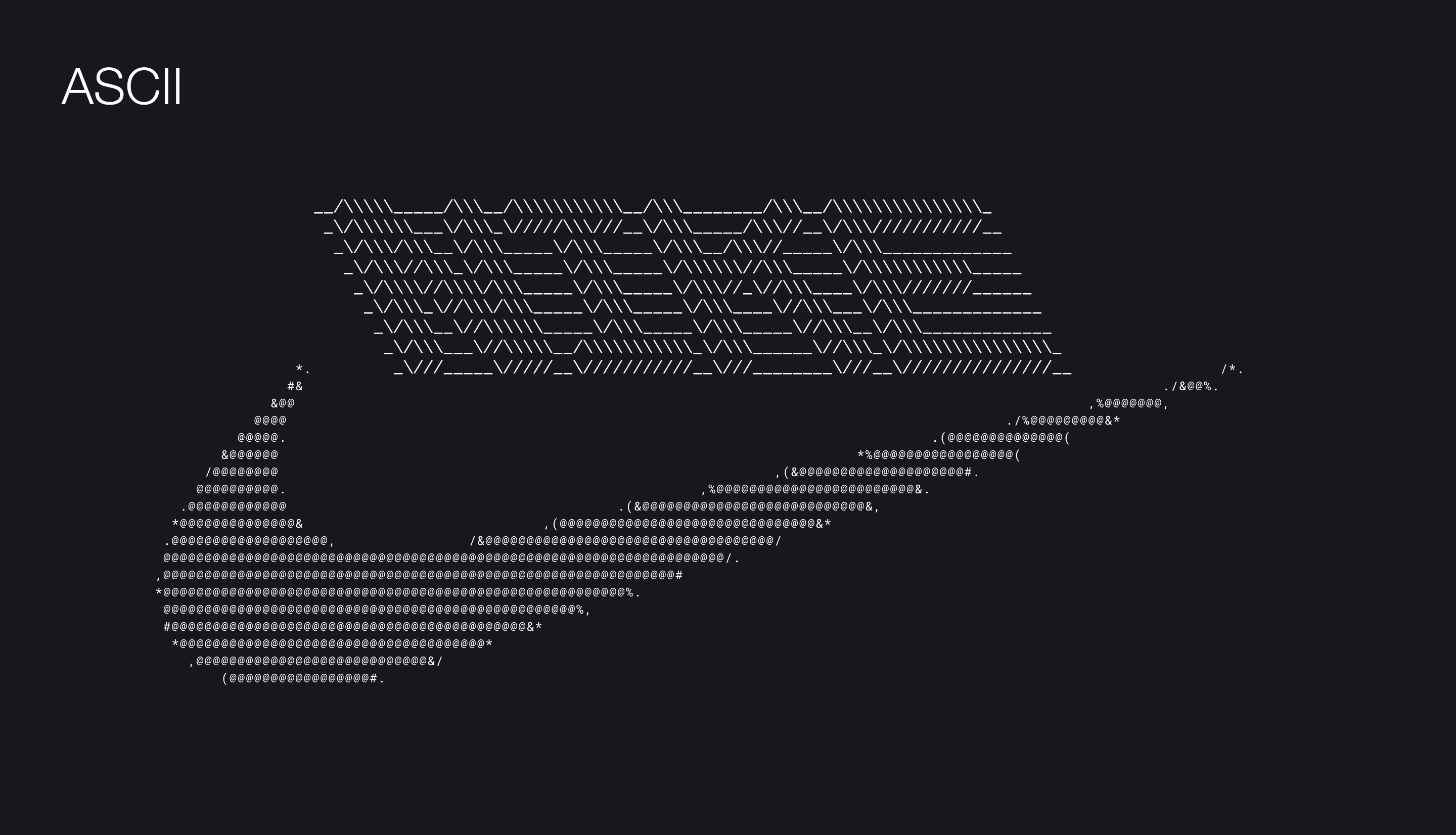
An early Nike OS concept based on early MS DOS terminals and ASCII, searching for a lo-fi homebrew look and feel.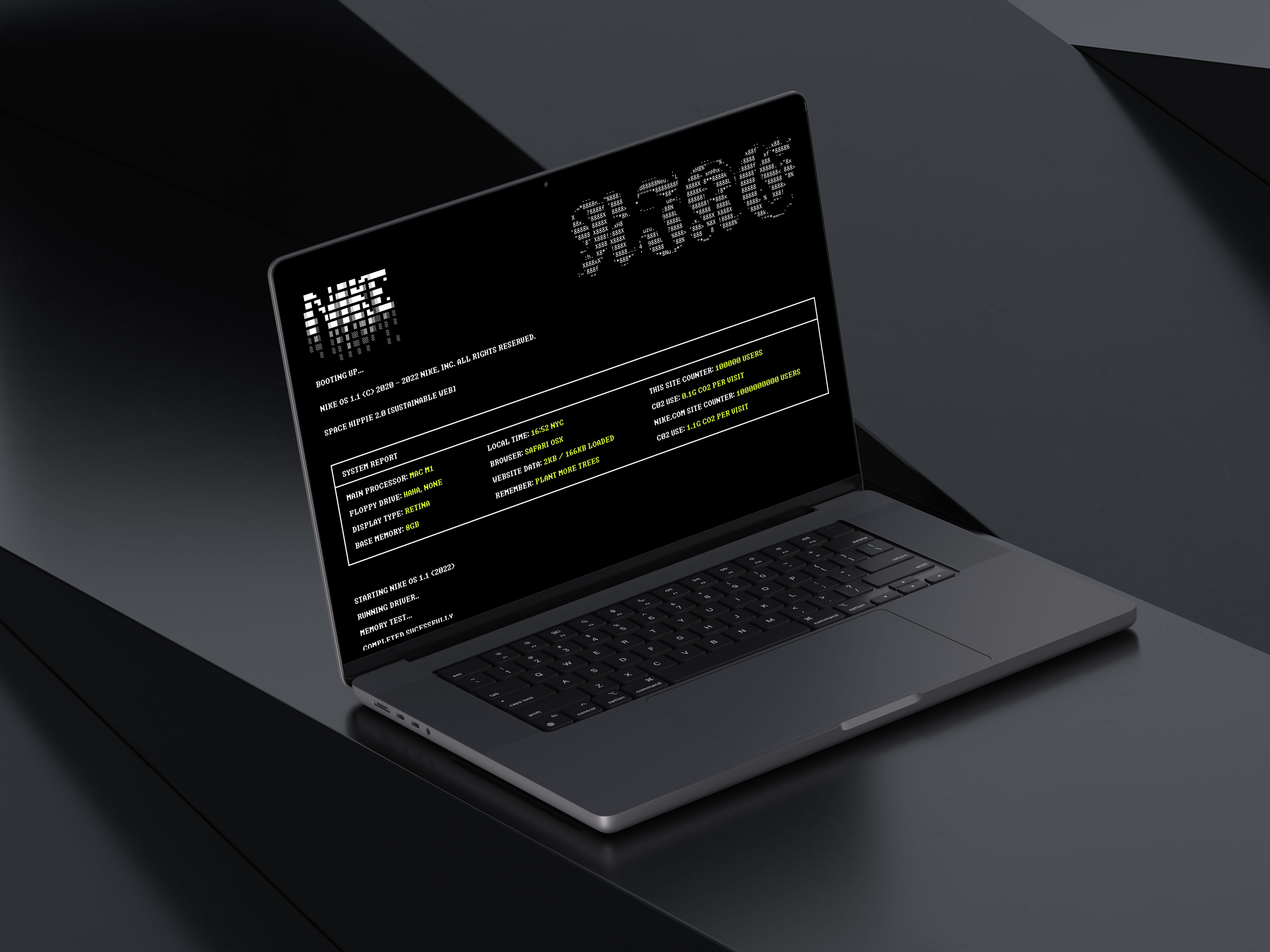
Evolution
This evolved to align with the Nike Circular Design System.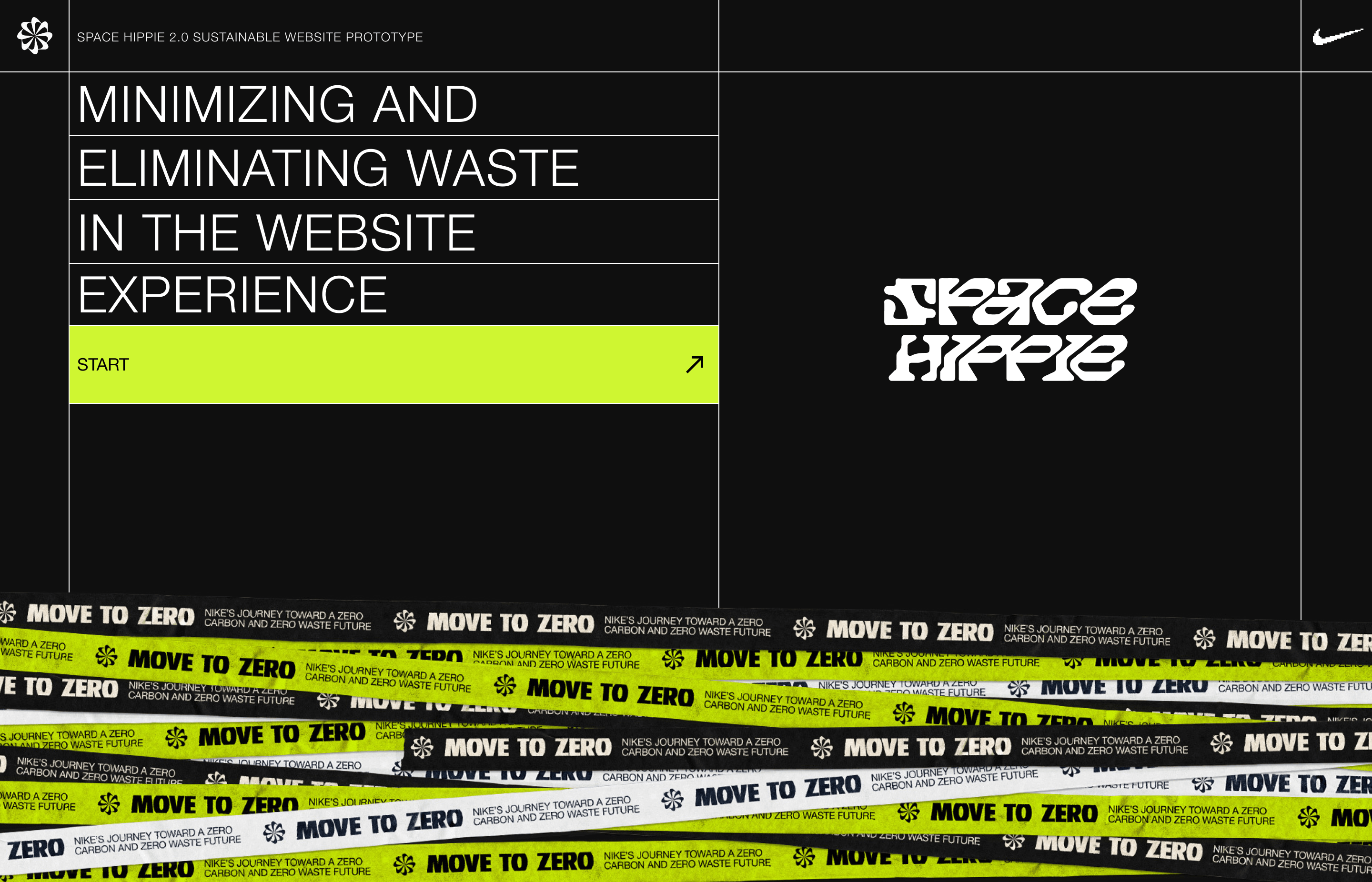



Prototype
A figma prototype can be viewed here︎︎︎ or choose to watch the short video below.Results
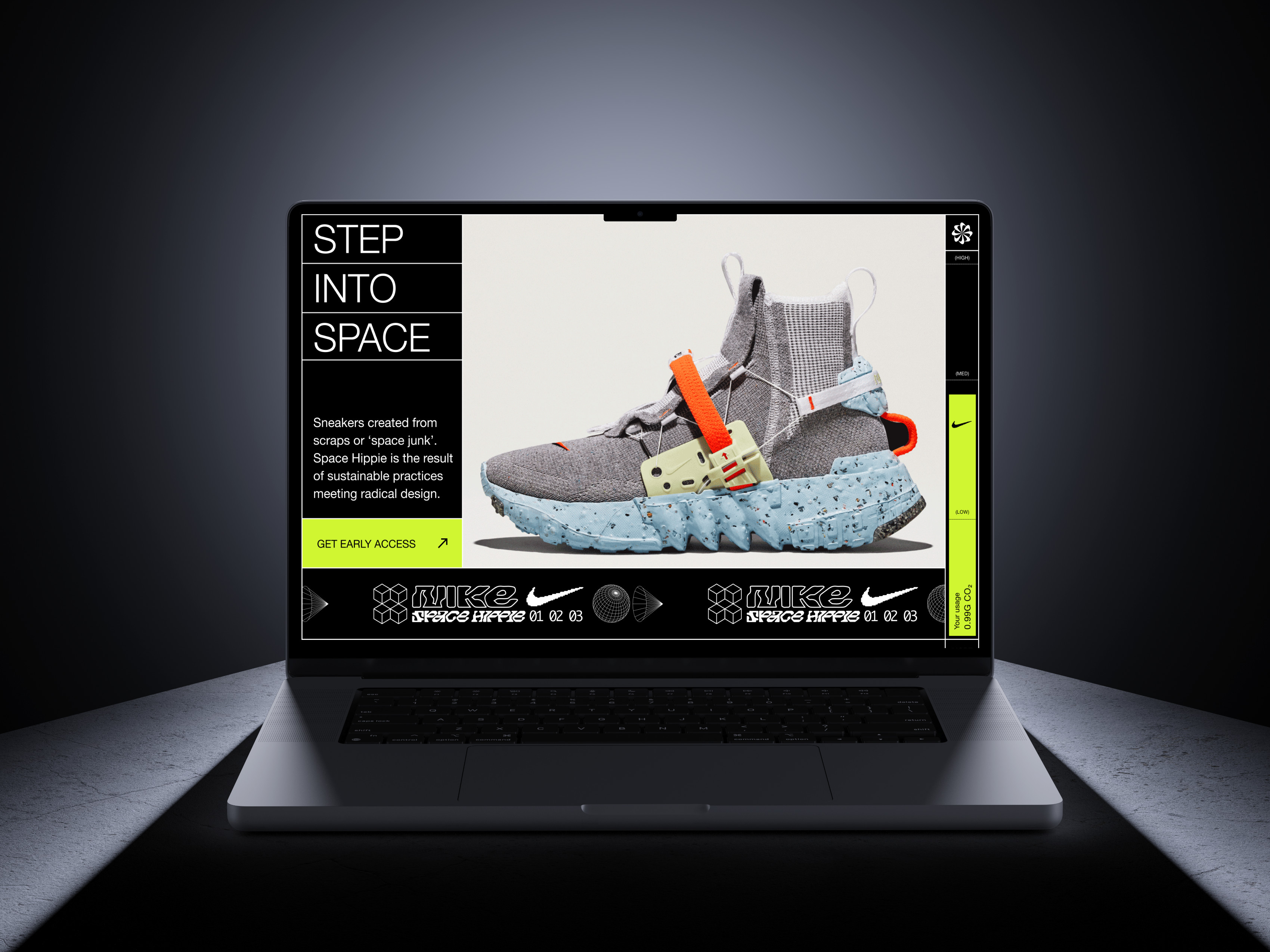
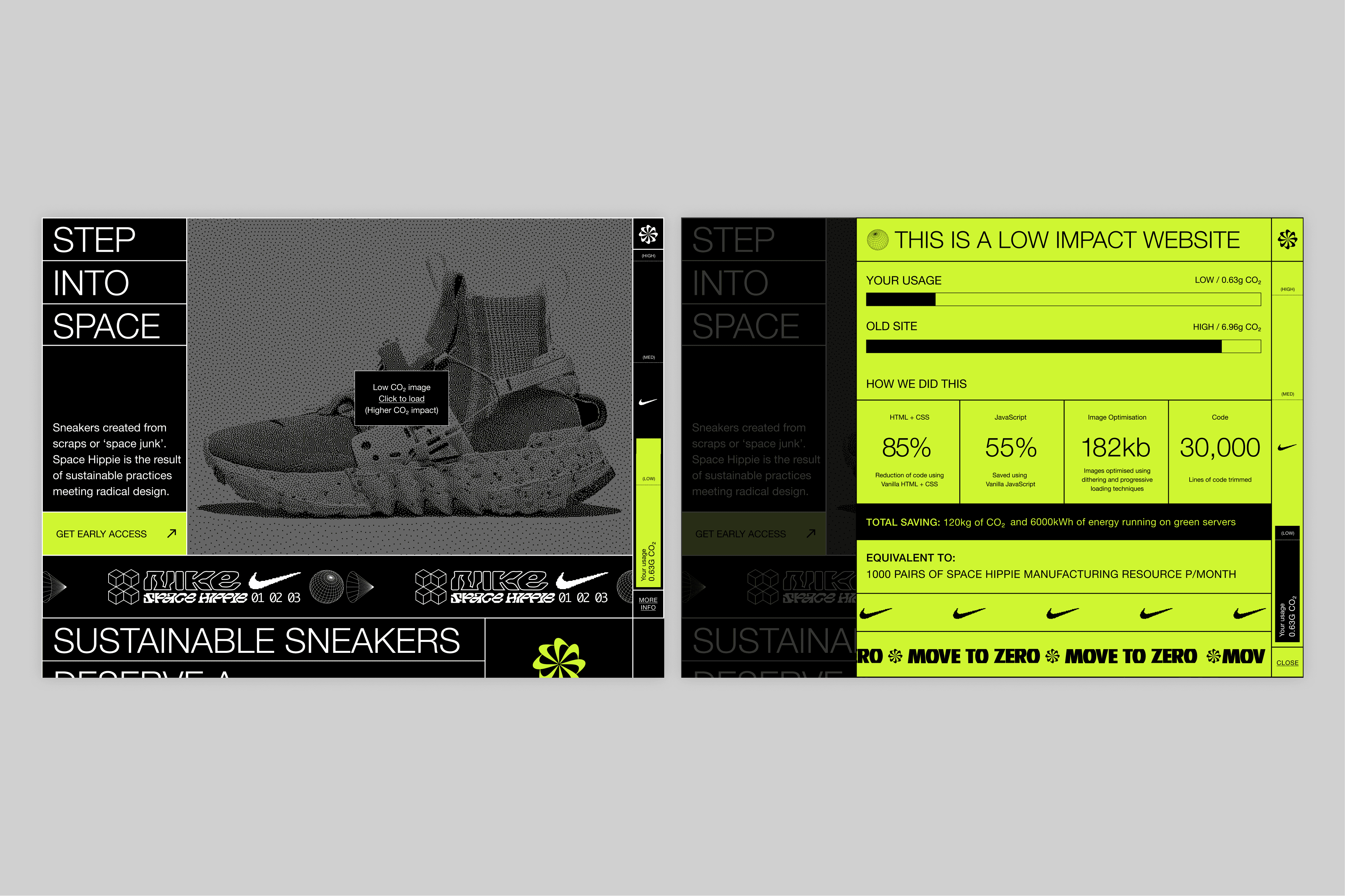
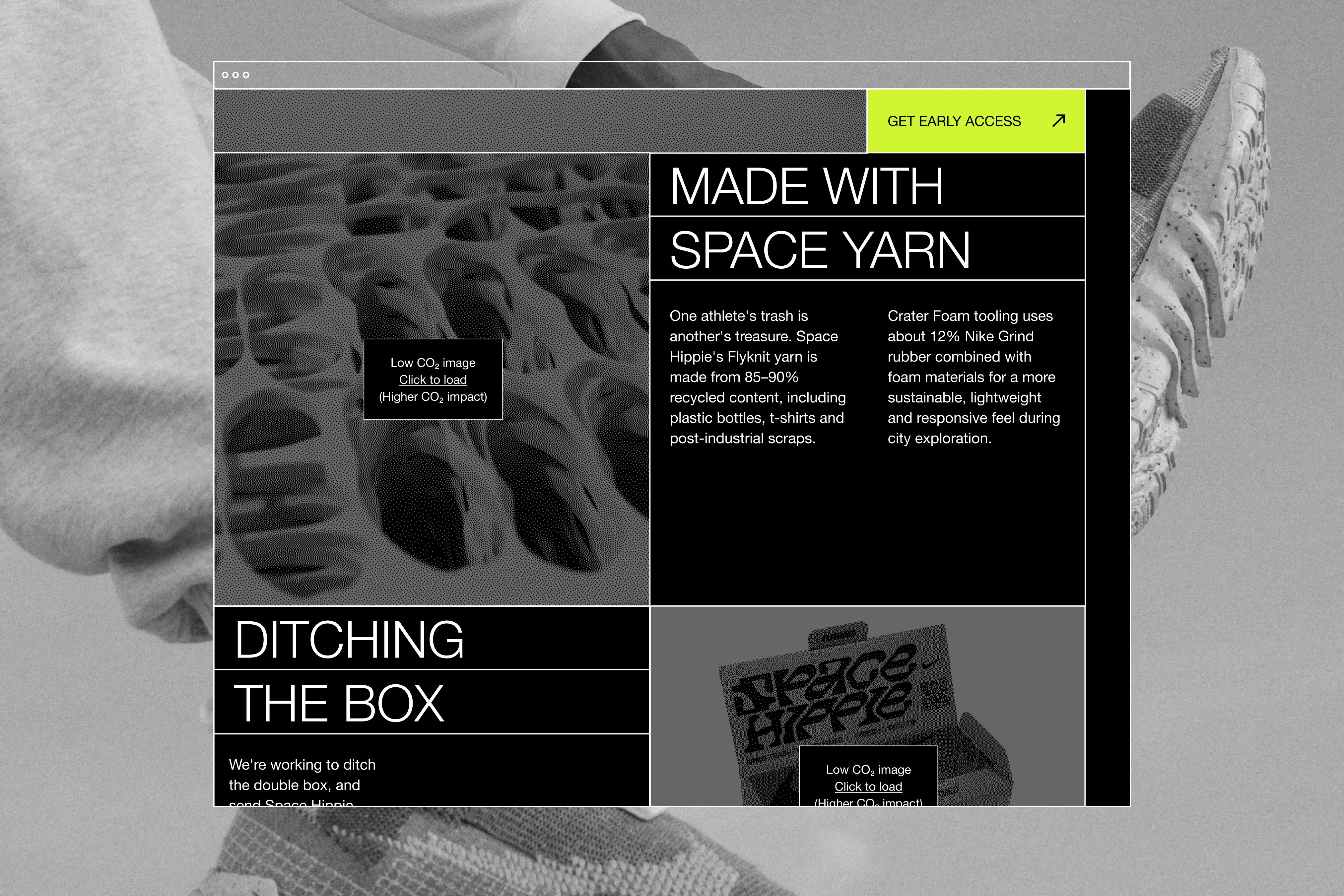
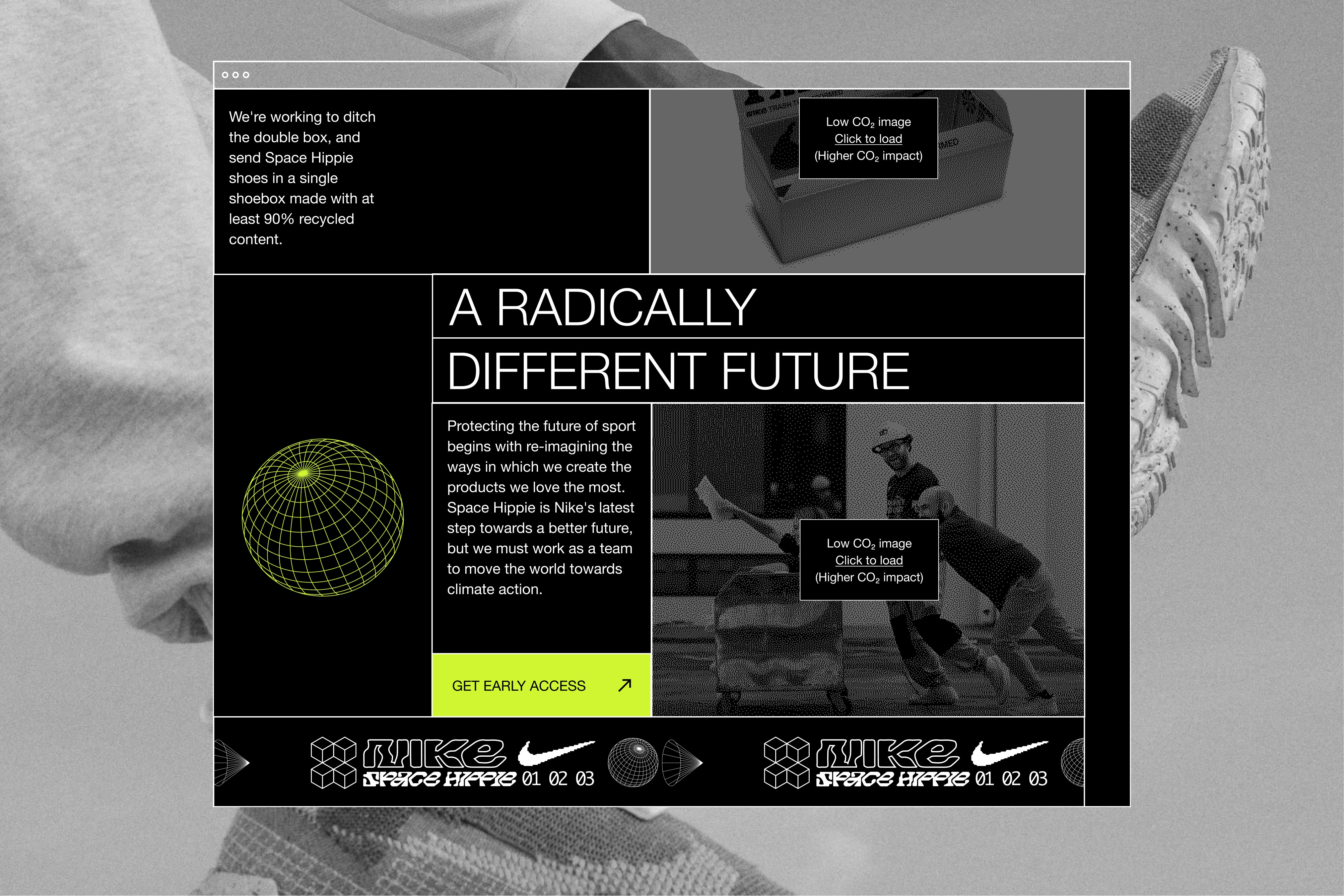
We developed three concepts, built two and hosted them on a Raspberry Pi. The final build combined all sustainable design principles to create an extremely lightweight landing page with maximum visual impact. Creating a website with a 98.72% smaller carbon impact in 3 weeks, this was proof of sustainable impact. - Dark mode exclusively
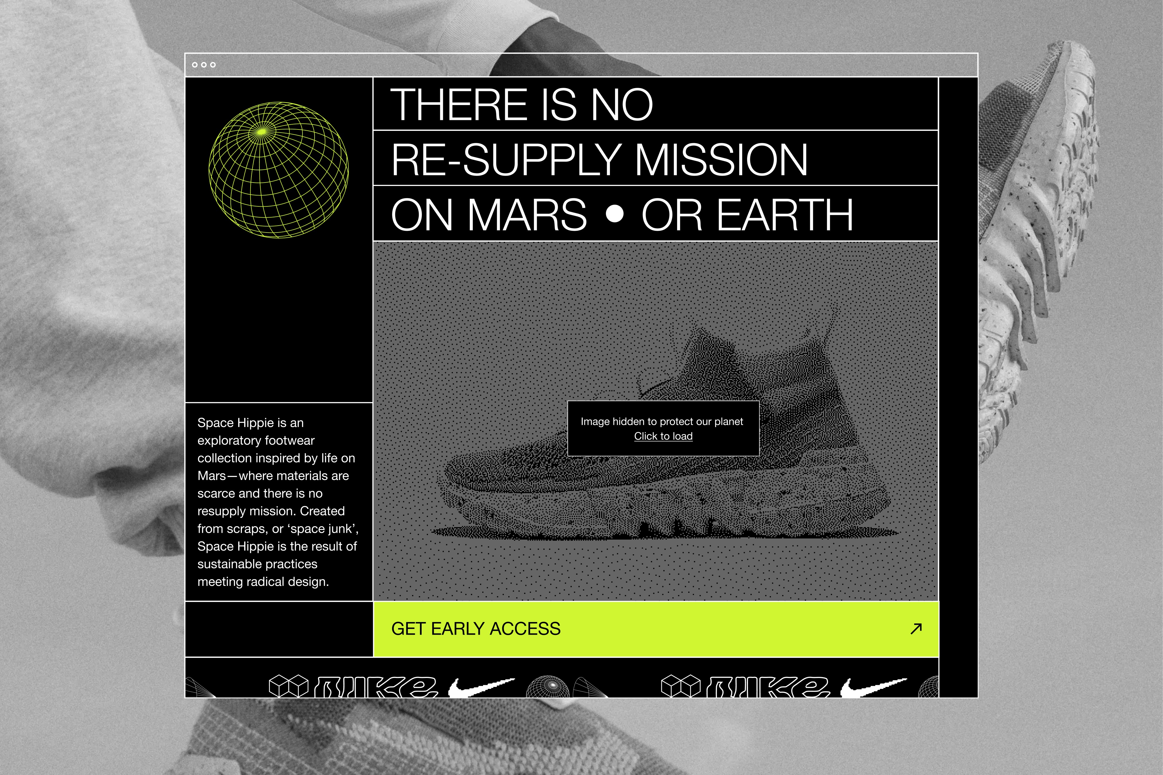
- Dithered images
- Progressive loading
- WebP optimised images
- Click to load content
- Reusable code blocks
- One system font, two weights
- SVG icons
- No video content
- An informative data panel showing the eco impact
Team:
Marie Vodickova, Robin Hunter, Liam Dean, James Penfold, Nick Voke.
Studio: Rehab